Difference between revisions of "emWin Widgets"
(Created page with "emWin '''Widgets''' are windows with object-like properties. They are used to make up elements of a user interface and react automatically to certain events (e.g. a click...") |
(→Available widgets) |
||
| Line 29: | Line 29: | ||
| [[IMAGE]] || [[File: Image.png]] || Image widget. Displays several image formats automatically. |
| [[IMAGE]] || [[File: Image.png]] || Image widget. Displays several image formats automatically. |
||
|- |
|- |
||
| − | | [[KNOB]] (deprecated) || [[File: Knob.png]] || Knob widget which can be used to adjust uncountable values. |
+ | | [[KNOB]] (deprecated) || [[File: Knob.png|200px]] || Knob widget which can be used to adjust uncountable values. |
|- |
|- |
||
| [[LISTBOX]] || [[File: Listbox.gif]] || Listbox which highlights items as they are selected by the user. |
| [[LISTBOX]] || [[File: Listbox.gif]] || Listbox which highlights items as they are selected by the user. |
||
Revision as of 16:30, 30 March 2020
emWin Widgets are windows with object-like properties. They are used to make up elements of a user interface and react automatically to certain events (e.g. a click of a BUTTON).
Widgets require the Window Manager. Once a widget is created, it is treated just like any other window. Like windows, widgets are also referred to by handles.
Available widgets
emWin offers many widgets that can be used in an application. The following table gives an overview of all of the widgets that are available.
| Widget name | Screenshot | Description |
|---|---|---|
| BUTTON | Button which can be pressed. Text or bitmaps may be displayed on a button. | |
| CHECKBOX | Check box which may be checked or unchecked. | |
| DROPDOWN |  |
Dropdown listbox, opens a listbox when pressed. |
| EDIT | Single-line edit field which prompts the user to type a number or text. | |
| FRAMEWIN | Frame window. Creates the typical GUI look. | |
| GRAPH | 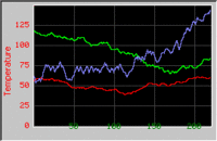 |
Graph widget, used to show curves or measured values. |
| HEADER | Header control, used to manage columns. | |
| ICONVIEW | Icon view widget. Useful for icon based platforms as found in common hand held devices. | |
| IMAGE |  |
Image widget. Displays several image formats automatically. |
| KNOB (deprecated) | 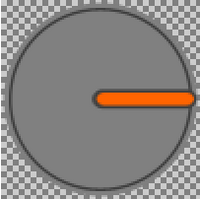 |
Knob widget which can be used to adjust uncountable values. |
| LISTBOX |  |
Listbox which highlights items as they are selected by the user. |
| LISTVIEW | 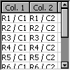 |
Listview widgets are used to creates tables. |
| LISTWHEEL | 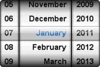 |
Listwheel widget. The data can be moved and accelerated via pointer input device. |
| MENU |  |
Menu widgets are used to create horizontal and vertical menus. |
| MULTIEDIT | 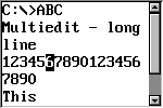 |
Multiedit widgets are used to edit multiple lines of text. |
| MULTIPAGE | 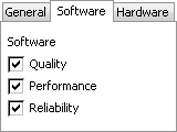 |
Multipage widgets are used to create dialogs with multiple pages. |
| PROGBAR | Progress bar used for visualization. | |
| RADIO |  |
Radio button which may be selected. Only one button may be selected at a time. |
| ROTARY | 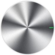 |
Rotary widget which can be rotated to return uncountable values. |
| SCROLLBAR | Scrollbar which may be horizontal or vertical. | |
| SLIDER | Slider bar used for changing values. | |
| SPINBOX | Spinning box to display and adjust a specific value. | |
| SWIPELIST | 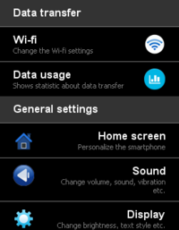 |
Swipelist widgets are used for creating swipeable lists which could be moved by swiping the finger (or any other PID) over the touch screen. |
| SWITCH |  |
Switch widget which can be toggled. |
| TEXT | Static text typically used in dialogs. | |
| TREEVIEW | 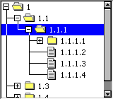 |
Treeview widget for managing hierarchical lists. |
| WINDOW | Simple window. |